


[NB: I’ve expanded the examples with the goal of making it easier to read and create causal loop diagrams.]
In my experience, the skills necessary for thinking about the world in terms of systems has been the single greatest cognitive asset in living a ready life. While expanding the decision space between stimulus and response, work to acquire new skills, habits, beliefs, mental models, and values that help maintain a healthy decision space by strengthening your ability to think about the world in terms of systems. System thinking and the skills required to master thinking about the world in this way will be a common thread through many posts on The Remnant's Way. To gain the most from posts that touch on systems thinking, understanding how to read causal loop diagrams will be essential. Learning how to create your own causal loop diagrams - sketched real-time on whatever scrap of paper is handy - will increase your systems thinking skills by an order of magnitude. Superpower!
Reading causal loop diagrams can be a little counter-intuitive, but when you understand how to read them, you'll understand the dynamic quality of the models that appear elsewhere on The Remnant's Way. The interactions between the various elements and the effects of those interactions on stocks and flows are typically represented by a solid black arrow (Figure 1.)

"A" has an interaction with "B" and that interaction is in the direction of "A" to "B." But what's the effect of "A's" interaction with "B?" To display this effect, a green open head arrow or a red closed head arrow is used to describe the type of interaction between the two elements.


A green open-head arrow (Figure 2) is a direct relationship. A red closed-head arrow (Figure 3) is an inverse relationship.
To help understand these relationships I'll present several thought experiments via analogy. Keeping these in mind when reading causal loop diagrams will make it easier to follow and understand the relationships. The first involves elevators and teeter-totters. The second involves the gas and break peddles in a car.
Elevators and Teeter-Totters
Imagine stepping onto an elevator with someone else. When you go up, so does your fellow passenger. When you go down, you both go down. This is how direct relationships work in causal loop diagrams. You are Person A in Figure 2 and your fellow passenger is Person B. Now imagine each of you are on opposite sides of a teeter-totter. In this case, when you go up, your partner goes down and vice versa. This is the inverse relationship shown in Figure 3. If A goes up then B goes down, if A goes down then B goes up.
Driving a Car
In systems, causal relationships aren't so balance. In an elevator, two people can't arrive at different floors during the same trip. And for partners on a teeter-totter, one goes up or down exactly as much as the other goes down or up. The change in position of the gas and break pedals in a car in relation to the speed of the vehicle are a little better fit to what's probably actually going on in a system.
For the second thought experiment, imagine sitting in the driver's seat of a car. It's a special car that has a constant speed of 40 miles per hour. It has been designed to go this speed with your feet off the peddles. (Not a particularly safe design feature, I'll grant. But this is a thought experiment. So ride along with me for a little while. I promise we won't crash.)
When you increase (↑) pressure on the gas peddle the car's speed increases (↑). More pressure on the gas, more speed. If you then decrease (↓) pressure on the gas peddle the car's speed decreases (↓) until it returns to the original 40 MPH. Less pressure on the gas, less speed. More leads to more, less leads to less. That's the direct relationship illustrated between "A" and "B" in Figure 2. As "A" increases, so does "B." As "A" decreases, so does "B." More of "A" results in more of "B" (↑↑) while less of "A" results in less of "B." (↓↓) This relationship is represented by the green open-head arrow.
Now for the brake. If you increase (↑) pressure on the brake peddle the car's speed decreases (↓) – it slows down to something less than 40 miles per hour. Increase the pressure on the brake enough and the car will stop. More pressure on the brake, less speed. However, if you decrease (↓) pressure on the brake the car's speed begins to increase (↑). If you remove all pressure on the brake peddle, the car returns to the constant 40 mile per hour speed. Less pressure on the brake, more speed. That's the inverse relationship illustrated between "A" and "B" in Figure 3. As "A" increases, "B" goes the opposite way and decreases. As "A" decreases, "B" goes the opposite way and increases. More of "A" results in of less of "B" (↑↓) while less of "A" results in more of "B." (↓↑) This relationship is represented by the red closed-head arrow.
Life in the Real World
For an example of these relationships with something closer to the real world, let's look at the dynamics behind two cosmic quandaries: Which came first, the chicken or the egg and why do chickens cross the road?
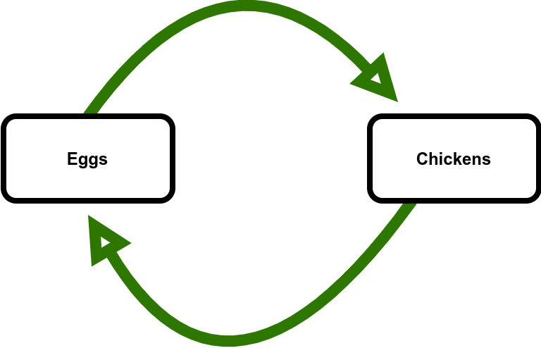
No matter which came first, eggs come from chickens and chickens come from eggs. If the number of eggs increase, the number of chickens will increase. If the number of eggs decrease, the number of chickens will decrease (Figure 4.)

If the number of chickens increase, the number of eggs will increase. If the number of chickens decrease, the number of eggs will decrease (Figure 5.)

These are direct relationships as described for Figure 2. Taken together, the causal loop diagram is shown in Figure 6.
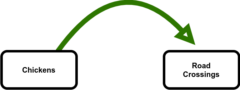
If times are good, there are more and more eggs leading to more and more chickens and Chicken World starts to get a bit crowded. In search of a better life, some of the chickens decide to cross the road (now you know why they cross the road!) Another direct relationship in the system (Figure 7.)
However, life is so good on the other side of the road that chickens never cross back over to where they started. An increase in the number road crossings result in a decrease in the number of chickens in the homeland. (Figure 8.) This is an inverse relationship as described for Figure 3.

Connecting all the pieces, the very simple causal loop diagram describing Chicken World is shown in Figure 9.

This simple example illustrates how systems stay balanced. If there are too many eggs, leading to too many chickens, more chickens cross the road until the population is restored to a sustainable level. If too many chickens cross the road, the number of chickens decrease and therefore so do the number of eggs which means there are fewer chickens crossing road. Once again, the population is eventually restored to a sustainable level.
That's all the system dynamics you'll need to read the causal loop diagrams presented in subsequent posts.
Time for some practice.
Sketch a causal loop diagram that illustrates the relationships between the temperature in your home and the thermostat that controls the air conditioning and heat.

Hint: Is it like eggs and chickens or like chickens crossing the road? Send me a DM if you'd like any feedback.
"Master Systems Thinking" last updated on 2025.03.12.
I hope you will return regularly to The Remnant's Way as I often update posts, particularly Ab Initio, and do not always publish to email posts that are meant to support or serve as reference to existing or future posts.
And please consider becoming a paid subscriber. Doing so supports my writing efforts and grants me the most precious of all resources - dedicated time for writing. And for that, I am deeply grateful.
Photo by Conny Schneider on Unsplash
Illustrations: Gregory Engel